Experiments (Results)
Once your experiment is up and running, you will be able to track how it is performing in the Experiment Results tab. This can be found on any Experiment page under the Results tab at the top.
There, you can update your analysis, configure how you want your analysis to run, and see the impact of your experiment on your metrics.
Experiment Results Table
The heart of the experiment results page is the table of results. What you will see will depend a little bit on whether you are using our Bayesian or our Frequentist engine, as well as whether your experiment has 2 variations or if it has 3+, but in either case the first two data columns will look the same, and each row will represent one comparison between baseline and variation for one metric.

In both engines, the first two data columns are:
Baseline - the average value of the metric in the baseline variation; either a percentage of users in that variation (for proportion metrics) or an average value for mean or ratio metrics. Variation the average value of the metric in the comparison variation.
For both columns, the raw data in grey underneath shows the numerator and denominator totals.
Experiment Results Statistics (Bayesian Engine)
Chance to Win tells you the probability that the variation is better. Anything above 95% (a customizable threshold set at the organization level) is highlighted green indicating a very clear winner. Anything below 5% is highlighted red, indicating a very clear loser. Anything in between is grayed out indicating it's inconclusive. If that's the case, there's either no measurable difference or you haven't gathered enough data yet.
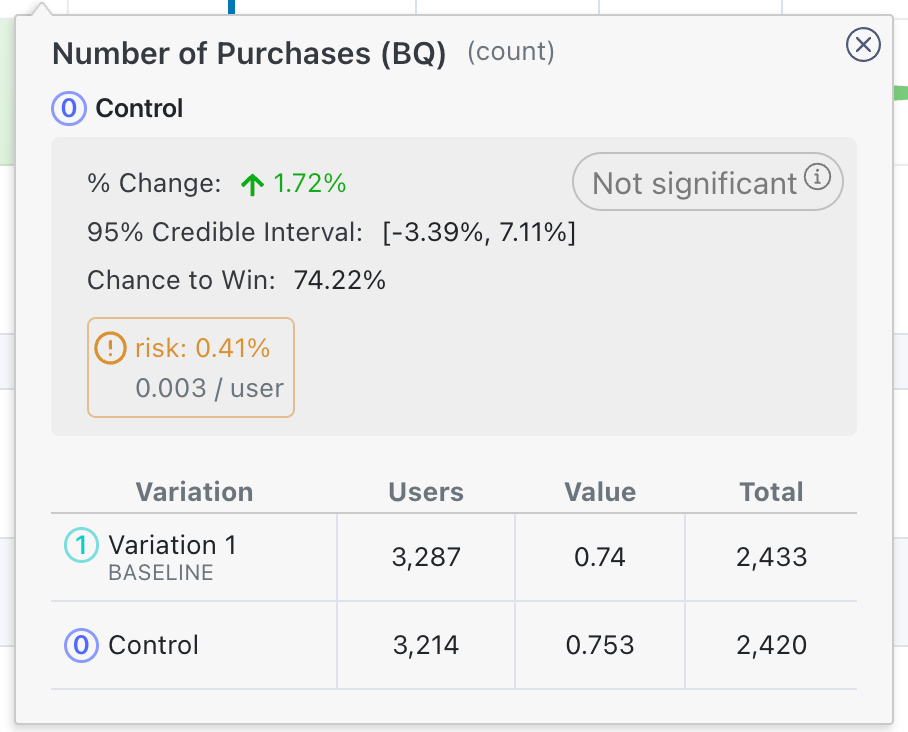
Furthermore, we include tooltips for Risk, which captures the average loss in a metric if the variation were actually to be worse than control. We use this tooltip to let you know about "risky" cases. For example, in cases like in the screenshot above, the chance to win is above 50% for a few metrics, but the average loss if the baseline was actually better is above the risk threshold, indicating that shipping the variation still has substantial risk. More information about risk is available in a tooltip when you mouseover the result:

The graph and the % Change column show you how much better/worse the variation is compared to the baseline. It is a probability density graph and the thicker the area, the more likely the true percent change will be there. As you collect more data, the tails of the graphs will shorten, indicating more certainty around the estimates.
Experiment Results Table (Frequentist Engine)
If you select the "Frequentist" engine, when you navigate to the results tab to view and update the results, you will see the following results table:

The P-value column is the probability that the experiment effect for a varitopm would have been observed if the true effect was zero. When the p-value is less than 0.05 (a customizable threshold set at the organization level) and the experiment effect is in the preferred direction, we highlight the cell green, indicating it is a clear winner. When the p-value is less than 0.05 and the experiment effect is opposite the preferred direction, we highlight the cell red, indicating the variant is a clear loser on this metric.
The graph now represents a 95% confidence interval (or 100*(1 - )% confidence interval if you have a custom significance threshold other than 0.05).
The % Change column is unaffected, although we now also represent the width of the confidence interval in grey.
Guardrails
In the new results view (as of GrowthBook 2.4), guardrail metrics are treated much like regular metrics, but they are placed in a separate part of the results view, have an additional tooltip warning if they are trending in the wrong direction, and are not part of any p-value corrections in the frequentist engine (in other words, even with p-value corrections applied, these results will be more sensitive to negative or positive trends).
Sample Ratio Mismatch (SRM)
Every experiment automatically checks for a Sample Ratio Mismatch and will warn you if found. This happens when you expect a certain traffic split (e.g. 50/50) but you see something significantly different (e.g. 46/54). We only show this warning if the p-value is less than 0.001, which means it's extremely unlikely to occur by chance.

Like the warning says, you shouldn't trust the results since they are likely misleading. Instead, find and fix the source of the bug and restart the experiment.
Results Table Settings
There are several settings at the top of the results table that allow you to control your results.
Variations
This option allows you to filter which variations are shown in the results table, in the case that you have 3+ variations in your experiment.
Baseline Variation
This option allows you to change which variation is the baseline variation. This is particularly useful in the case when you have one control and two treatment variations. In this case, our result defaults to showing you the statistics comparing each treatment variation versus the baseline variation, but you may want to additionally analyze how the treatment variations compare to one another.
In that case, you can switch the baseline to be one of the treatment variations to directly compare treatment 1 to treatment 2.
Difference Types
A "difference type" is the way we measure the difference in variations. There are three difference types that you can select from"
Relative- The default, this is the relative change or "uplift" of your variation when compared to the baseline. Specifically, theRelativechange is where and are the averages in the treatment and baseline variations respectively. Effects here tell you that the average user value in the variation was X% greater than the average user value in treatment. For example, if your metric is Revenue and your baseline average is 10.00 and your variation average is 10.31, then yourRelativechange is 3.1\%.Absolute- This is simply the difference in average values across your variations --- . This can help you understand the raw difference in average values, e.g. the treatment leads to an increase in revenue of $0.31 per user in the above example.Scaled Impact- This helps you understand the daily total (as opposed to average) effect that your experiment would have had if 100% of users that would have been exposed to your treatment variation had gotten that treatment variation. It is computed as , where is the number of users that are in your treatment variation, is the percent of all traffic that is in that variation, and is the number of days in the current phase used for the results. So if your experiment ran on 10% of traffic for 20 days, with 5% going to the treatment variation, and there were 5,000 users in your treatment variation, the scaled impact would be dollars per day. This implies that this experiment would have lead to a increase in total revenue per day if every user that could have been exposed the variation had been exposed to the variation.
These difference types can have slightly different statistics in the case of the Frequentist engine, because for Absolute and Scaled Impact differences, we do need to account for the uncertainty in estimating as we do with Relative difference types (which forces us to use a delta method derived variance to properly handle).
Furthermore, with CUPED enabled in the Frequentist engine, you may find that the changes are not exactly the same as the difference in raw variation averages, due to CUPED adjusting those averages under the hood to reduce variance.
Dimensions
Dimensions allow you to slice and dice your data, but require additional queries to compute.
User or Experiment
If you have defined dimensions for your data source, you can use the Dimension dropdown to drill down into your results. For SQL integrations (e.g. non-MixPanel) GrowthBook enforces one dimension per user to prevent statistical bias and to simplify analyses. For more on how GrowthBook picks a dimension when more than one are present for a user, see the Dimensions documentation. This is very useful for debugging (e.g. if Safari is down, but the other browsers are fine, you may have an implementation bug) or for better understanding your experiment effects.
Be careful. The more metrics and dimensions you look at, the more likely you are to see a false positive. If you find something that looks surprising, it's often worth a dedicated follow-up experiment to verify that it's real.
Date
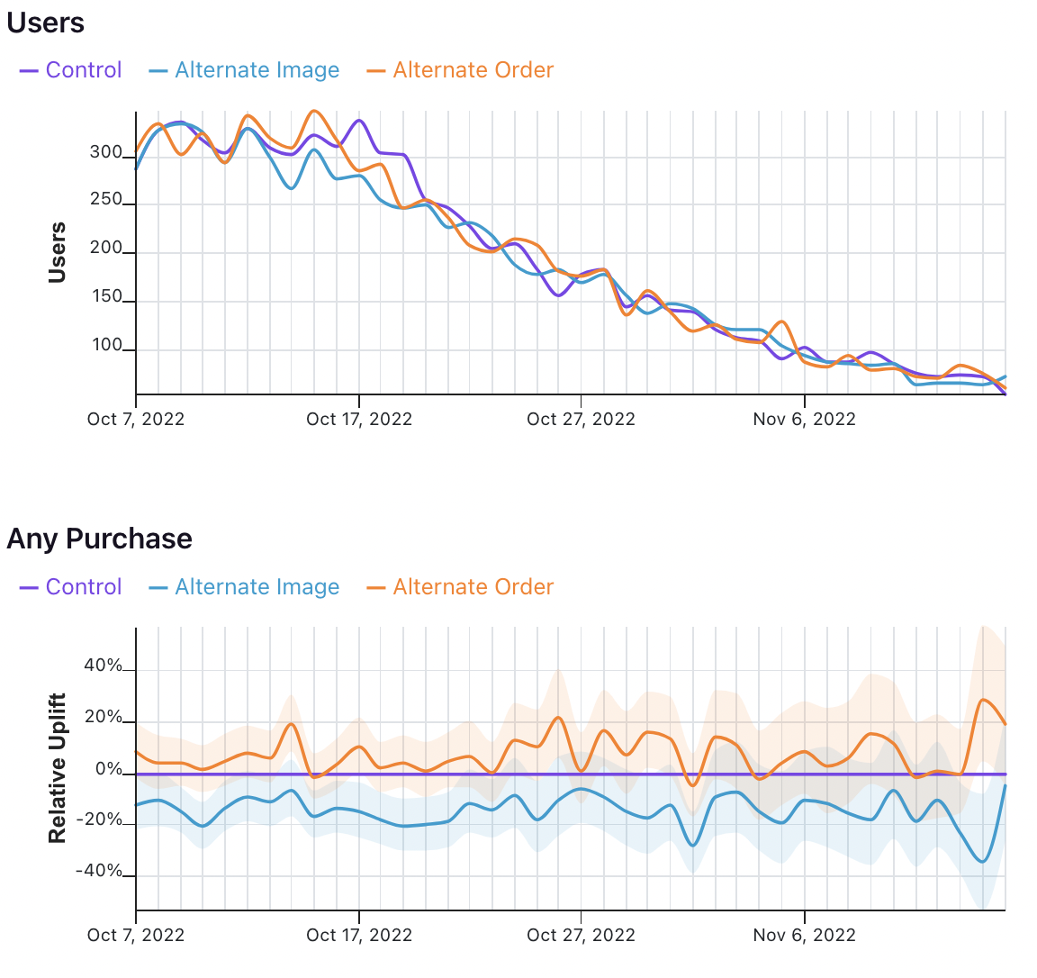
The date dimension shows a time series of the count of users first exposed to an experiment, as well as effects when comparing users first bucketed on each day.
Take the following results, for example.

In the first graph, we see the number of users who were first exposed to the experiment on that day.
In the second graph, we see the uplift for the two variations relative to the control for all users first bucketed on that day. That means that the values on October 7 show that users first exposed to the experiment on October 7 had X% uplift relative to control, when pooling all of the data in their relevant conversion window. It does not mean show the difference in conversions across variations on October 7 for all previously bucketed users.
That analysis, and other time series analyses, are on GrowthBook's roadmap.